Saturday, December 17, 2011

Project 2: Abstraction, Exploration, and Design: Linear Gallery_Stratton

IMAGE TOO LARGE COULD NOT PUT ON BLOG...


Concept

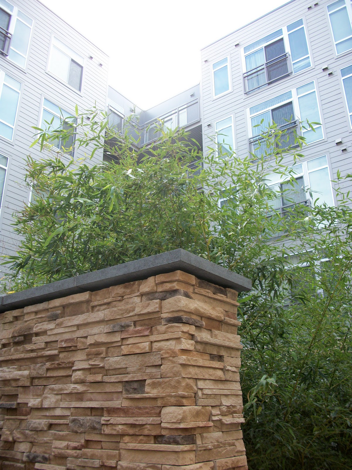
It was my intention to transform the original digital model into a space that could take shape in the current linear gallery.  The previous model was inspired by a photograph of a stone fireplace attempting to show how a pattern could also show texture by offsetting the location of the solid brick objects within the cross section. The cross section of the model became the basis to guide the design process of the linear gallery. By transforming the cross section at different scales each part of the building could be formed. The plan, elevation, section and structure each used the cross section to create a cohesive architectural space. The new linear gallery that is formed is a space where art can be displayed and explored in a variety of different media. 

Tuesday, December 6, 2011

Part 1_Abstraction, Exploration and Design: Linear Gallery_Stratton


My concept will be the analysis of a linear organization of space, and how the consistency of spaces that are similar in size, shape and function (as each bay of the linear gallery is) can be manipulated along the main linear promenade creating a more interesting linear gallery. As used in the previous exercise I will be using the solid and void relationships (of the brick and mortar) to create different articulated rooms that push and pull through the space displaying art in many different lights.

Tuesday, November 29, 2011

Logo/Iteration_Stratton


It was my intention to create a series of logos where the logos directly represent the architectural space or idea of a “linear” gallery. I was inspired by the linear gallery’s form more than function, especially in its perspective views where a series of bays and frames are created. I was also inspired by the text “linear gallery” on the floor at the entrance and the rectangular patterns created by the floor and walls. My process consisted of abstracting the shade and shadow, depth, line as well as frame in the construction of the logos. I came up with three logo types and begin creating multiple iterations of each in ways where I thought the logo could be transferable to different sizes based on its level of detail. Including text in all of the logos was kept simple incorporated the words “linear gallery” in multiple facets to coincide with the image portion of the logo.

Tuesday, November 22, 2011

Digital Fabrication_Stratton


It was my intention to create from the digital model a physical model where the pattern could capture the solid/void relationship of the object in space, and display a difference in materiality which then could emphasize light and shadow. Taking only a portion of the digital model, I could then choose more carefully the composition I wanted to create by deleting parts of the pattern. Taking longitudinal and transverse sections through the object allowed the depth and complexity of the object to show. The use of two materials, plexi-glass and chipboard enabled me to model the positive and negative space (the bricks and the mortar) and allow light to move through the transparent material and create a physical model where light and shadow add an additional element.

Thursday, November 10, 2011

Surface and Light_Stratton


It was my intention to choose two photographs in which there were multiple layers of either space or pattern. For the space image, I wanted to create a since of threshold and in doing so used light in create three different compositions where the idea of what was the main threshold appeared to be different. In the pattern, I wanted to use modeling and light to create since of texture from solid forms, by emphasizing shade and shadow.

Thursday, November 3, 2011

Page, Spread, Layout_Stratton


My intention was to create a three part column grid with strong final drawings on the top and bottom of the page and a row of process cutting through the middle of each spread. The title page is a three dimensional image to capture the viewer and the resume is done is a simple manner.

Thursday, October 27, 2011

Analytical Space and Place_Stratton


My intentions for the composition were to create a sense of threshold before entering the linear gallery and how the sequence of bays creates a continuous linear display of windows and art work. I also wanted to show how the windows frame the view of the outdoors inviting the person into the gallery.

Tuesday, October 11, 2011

Stratton_Representation_P6


Continuing with the concept of the negative space between the characters creating a space in which is stronger than the positive space, the composition is empowered by the three dimensional perspective that places the viewer in position to see the deep space between the letters. The use of wire frame creates a higher sense of being within the space, and highlighted are the characters that define the negative space and help achieve a sense of movement in the perspective, just as the negative space does within the pattern.

Tuesday, October 4, 2011

Representation_Stratton


The idea was to construct a composition in which displayed in a three dimensional form the concept of the strong sense of negative space in between the characters. The use of light and shadow create the deep space between the letters.  The perspective creates a view which engages the viewer to look further into the distance to the original letter and how it developed from a single letter into a pattern, and finally into a three dimensional figure. The use of transparency gives shape to the three dimensional form, displaying the wireframe behind.

Tuesday, September 27, 2011

Solid Modeling_Stratton


In order to show how the negative space between characters creates a sense of space and movement, I extruded the negative space to place emphasis over the positive space of the letters. I changed the heights of the letters in relevance to how I perceived the negative space to flow in a three-dimensional form. Thus, creating a space where the negative space reads more strongly than the positive, and a sense of pattern between the letters.

Ortho_Line_Stratton

Ortho_Rendered_Stratton

Axon_Line_Stratton

Axon_Rendered_Stratton

Tuesday, September 20, 2011

Pattern and Layering_Stratton

The intent of the pattern is derived from my analysis of the word last week, on how multiple characters within the word created an interesting composition of negative space between parts of a single letter as well as the space between letters. I chose two of the letters that most prominently evoked this idea of negative space (H and K), and using the transformation tool allowed the pattern to derive from the many functions of negative space the two letters create as well as their relationship to themselves and other letters. The horizontals as well as the ends of the strokes are in a strong relation to one another as can be seen by the over lapping of characters as well as the translucency provided in the color pattern.


Tuesday, September 13, 2011

Project 2_Board2_Stratton

Intending a more ambiguous form to which the letters were arranged, to focus on the tails of the letters and how they give character to the letters as a figure, but also give shape to the ground where the letters are appearing to give a directional attitude.

Project 2_Board1_Stratton

Intending to show how the difference between how letters are expressed, where letters begin to contain other letters of a different character defining a negative space in the process.